Why Changing Fonts in Archicad Feels Like Defusing a Bomb
May 29, 2026Why Changing Fonts in Archicad Feels Like Defusing a Bomb
Every architect has been there.
You've just adopted a new template — or downloaded the latest update to one you've been using for months. It looks great. The organization is solid. The layers make sense. The pen weights are dialed in.
Then you open the font list.
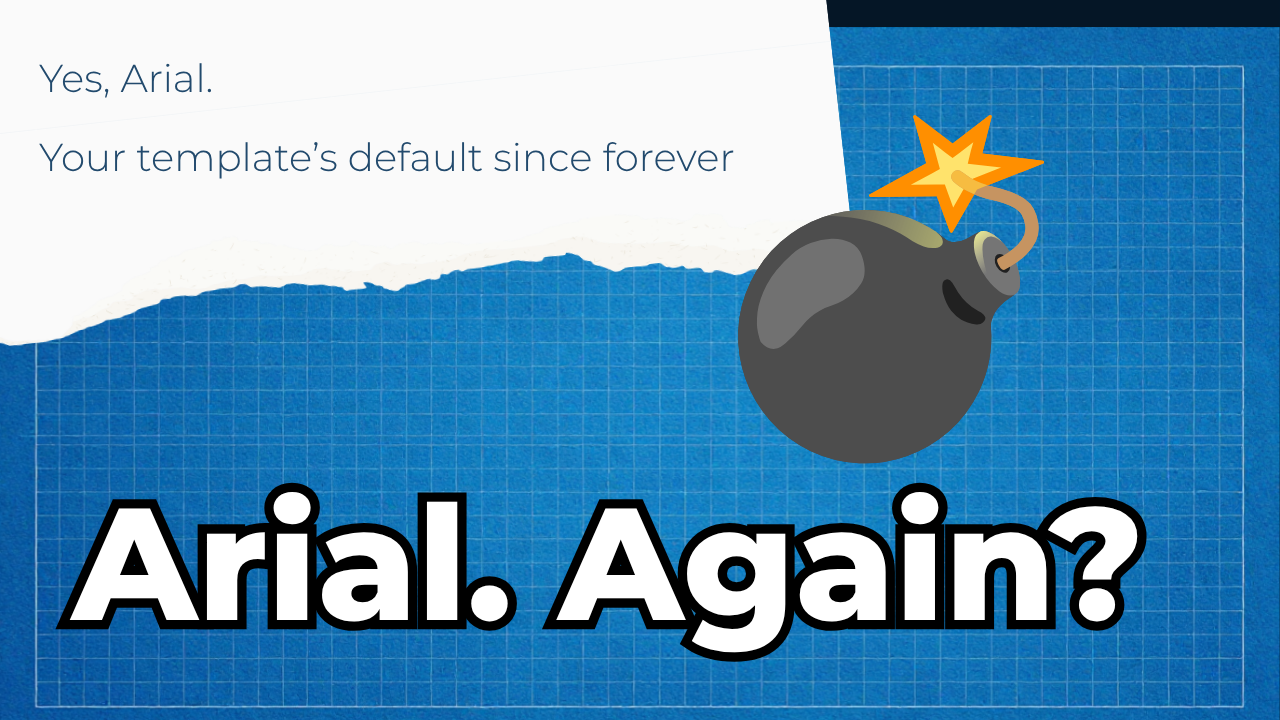
And you realize the entire thing is built on Arial.
The Font Problem Nobody Talks About
Here's the truth about Archicad templates and fonts: they're not designed for you to change them.
Not easily, anyway.
When a template ships, every text element — every label, every schedule header, every drawing title, every dimension string, every zone marker — has a font hardcoded into it. Not just suggested. Hardcoded. Baked into saved favorites, placed text blocks, title block objects, GDL parameters, dimension styles, and annotation settings.
If you want to use your firm's font instead of whatever the template author chose, you're looking at:
- Opening every text favorite one by one
- Changing the font manually in each
- Hunting down every placed text element in every master layout
- Updating dimension styles separately
- Fixing zone stamps, markers, and callouts that are buried inside GDL objects
- Doing it all again when the next template update drops
For a well-built template with 30+ text favorites and populated master layouts, that's easily four to six hours of work. For one font change. And if you get a new BIM package, a template update, or a new set of master layouts? You start over.
Most firms just don't bother. They keep Arial. They ship documents that look like every other firm's documents. They tell themselves they'll sort it out later.
Later never comes.
Why This Is Worse Than It Looks
The font problem isn't just an aesthetic inconvenience. It's a documentation standards problem.
When your template has no coherent font system, you end up with:
Inconsistency across projects. One project gets Calibri because someone changed it manually. Another stays on Arial. A third gets whatever font was on the laptop of the person who set it up. Your firm's documentation looks different from job to job.
No upgrade path. Every time you receive a template update or new content package, you're choosing between two bad options: skip the update and miss improvements, or apply it and lose your font customizations.
New staff onboarding friction. Every new person who opens your template has to figure out the font situation from scratch. There's no system. There's no documentation. There's just Arial and a prayer.
Template adoption barriers. If you're evaluating a third-party template like CB2.0, the font question is always in the back of your mind: "How long is it going to take me to make this look like us?"
These aren't small problems. They're the reason most firms never truly standardize their documentation. The friction is too high and the payoff feels too uncertain.
What CONTRABIM Did About It
We built CONTRABIM Fonts.
Not a workaround. Not a tutorial. A system.
CONTRABIM Fonts is a font slot architecture built directly into the CB2.0 template. Instead of hardcoding a specific typeface throughout the template, every text element is assigned to one of three named font slots:
CB-1 Titles — Headers, drawing titles, legend headers, section callouts
CB-2 Text — Labels, notes, schedules, general text, zone names
CB-3 Markers — Dimensions, markers, callouts, grid text
Those three slots ship pre-loaded with a clean, professional open-license typeface. Out of the box, CB2.0 looks sharp and consistent. No configuration required.
But here's where it gets powerful.
One Install. Everything Changes.
CONTRABIM Fonts works like this: the font slot names are fixed. The glyphs inside them are not.
When you install CB Fonts on your machine, you're installing fonts named CB-1 Titles, CB-2 Text, and CB-3 Markers. Archicad sees those names and renders whatever typeface is assigned to each slot.
Want to use your firm's licensed font instead? Run the CONTRABIM Font Installer, point it at your font files, and it generates new CB font files using your glyphs — same slot names, different letterforms. Install them. Done.
Every text element in every master layout, every saved favorite, every placed note and schedule and title block — all update simultaneously. No hunting. No manual edits. No Archicad open.
The whole process takes under two minutes.
And it gets better.
Future-Proof by Design
Here's what happens when you receive a CB2.0 template update or a new BIM package:
Nothing. You do nothing.
Because the new content is already built on the same three font slots. It arrives pre-assigned to CB-1 Titles, CB-2 Text, and CB-3 Markers — the same slots you've already customized. Your font preferences apply automatically to every new element, every new master layout, every new package.
No re-customization. No starting over. No choosing between staying current and keeping your standards.
This is what a properly engineered template system looks like.
The Caps Question
One more thing we solved while we were at it.
A lot of architectural practices want their headers and titles in ALL CAPS. It's clean. It reads well at small sizes. It's a legitimate documentation standard.
In a typical Archicad setup, achieving consistent all-caps text means either typing in all caps manually — which breaks the moment someone forgets — or hoping Archicad's text formatting behaves consistently across element types. It doesn't, always.
CONTRABIM Fonts solves this at the font level. Each slot has a Caps variant — CB-1 Titles Caps, CB-2 Text Caps, CB-3 Markers Caps — where the font itself renders everything in uppercase regardless of how it's typed. Assign the Caps variant to any favorite where you want all-caps output. It never breaks. It never forgets. It works everywhere the font is used.
What This Feels Like in Practice
Imagine opening CB2.0 for the first time. You run the font installer, pick your preferred typeface for each slot, choose whether you want caps or proper case per category. Six minutes later your entire template — every label, every title, every dimension, every schedule, every master layout — reflects your firm's typographic identity.
Not close to it. Not most of it. All of it.
Then six months later, you get a CB2.0 update with new master layouts, new BIM packages, new content. You open the template. Everything already looks like you. Because it is you.
That's what documentation standards feel like when they actually work.
Ready to Stop Fighting Your Template?
CONTRABIM Fonts ships as part of CB2.0. It's not a plugin, not an add-on, not a workaround. It's built into the foundation of the template system.
If you've been putting off adopting a proper Archicad template because you didn't want to spend a week making it look like your firm — this is the answer you've been waiting for.
Sign up for CB2.0 at contrabim.com
Your fonts. Your standards. Your template.
John, from CONTRABIM
Stay connected with news and updates!
Join our mailing list to receive the latest news and updates from our team.
Don't worry, your information will not be shared.
We hate SPAM. We will never sell your information, for any reason.